Neal Julian

Challenge:

     Update an existing product to better fit with a company’s design system.

Project Overview:

     The product: 
          Aladtec is a desktop product that was acquired by a new parent company in the winter of 2021. I worked alongside another UX Designer and three developers to bring this product up to company standards.

     Project duration:
          Winter 2021

     The problem:
          Aladtec was outdated and inaccessible. It also didn’t fit the look of the parent company’s other products.

     The goal:
          Update and redesign the product to better fit with the company’s other products, while maintaining usability and not alienating the current user base.

     My role:
          UX and Visual Designer mocking up changes to hand to developers.

     Responsibilities:
           High-fidelity prototyping, product mockups, conducting usability studies, accounting for accessibility, and iterating on designs.

User Research:

     Summary:
          Another designer and I conducted interviews to understand the users and their needs for this product. A primary user group identified through research were older working adults that were adverse to change and had very specific tasks associated with the product. 

Pain Points:

Real Estate

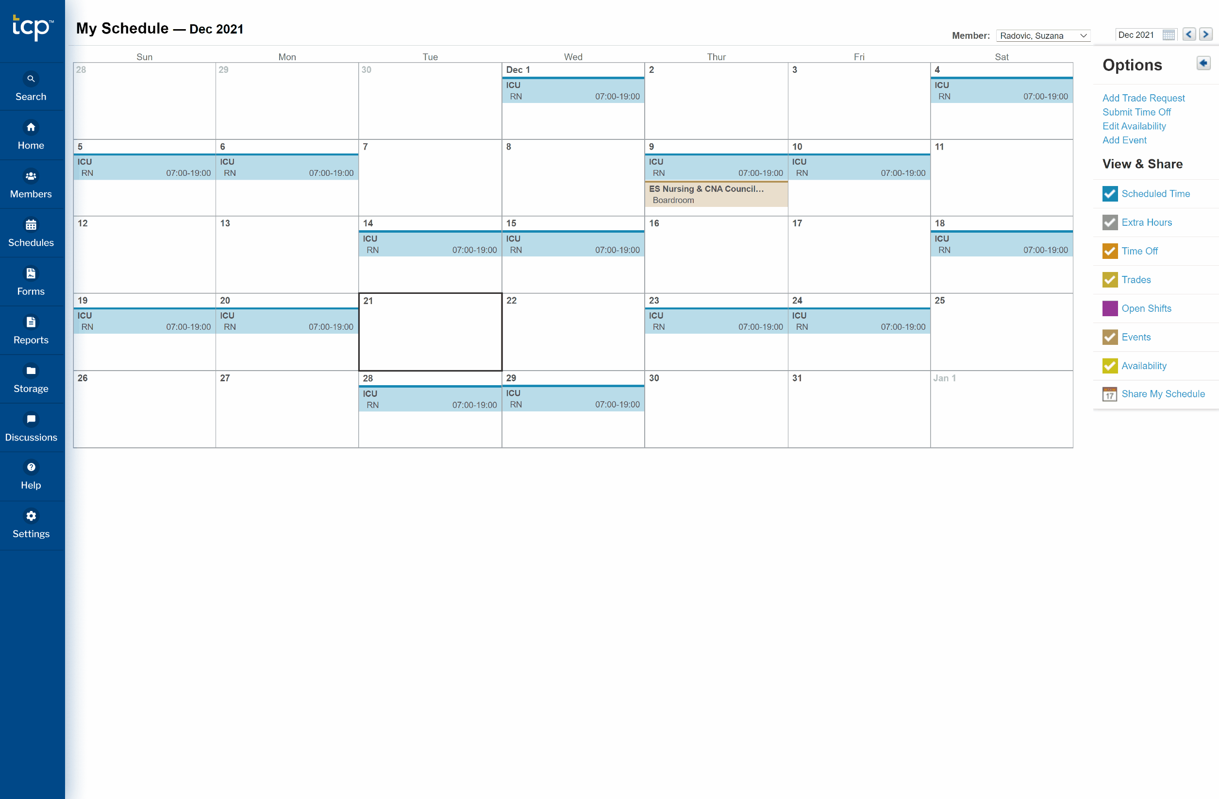
Most users used tables inside the product and did not like any header or menu that would take up vertical space on the page, as it would push their tables further down the page.

Clarity

A lot of the text was very small on the website, causing users to zoom on every page in order to read the content.

Color

Many colors used all over the website did not pass accessibility standards and made everyday tasks more difficult for users.

Initial Designs:

First wave changes:

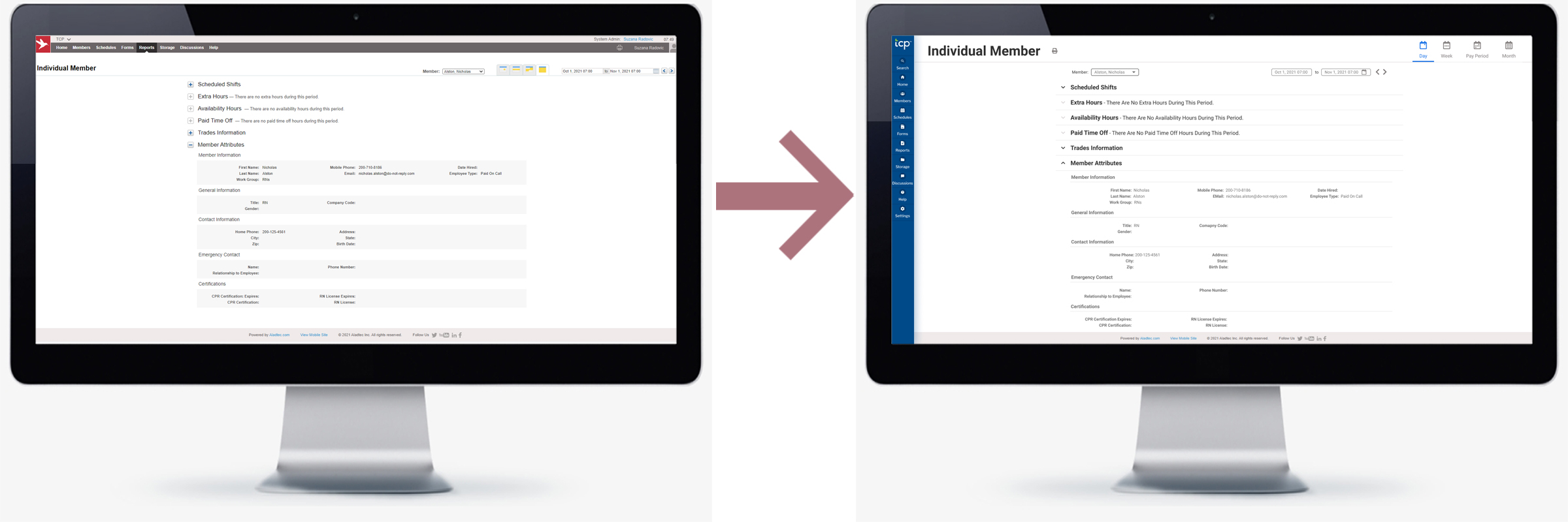
The first thing we did was comb through the product and we pulled out all components, iconography, colors, etc. and redesigned everything so it better fit the parent company's brand. This redesign phase also allowed me to make the text and colors more accessible by increasing size and contrast wherever possible.

In this initial phase, I created before and after mockups in Figma along with detailed descriptions of every component, so once we handed it off to developers, they would have everything they needed.

New Menu Prototype:

As the developers began their work on phase one, I switched gears and began working on a new navigation system for the product. After a preliminary round of surveying, we found that the number one concern for users was space. This led our team to concluded that a collapsible side menu would be of benefit.

Usability study:

     The Findings: 
          We found that users primarily worked in tables on the website, and didn’t want anything that would push their tables “below the fold” of the page.  

     Round One:

  1. The initial design pushed content to the right as it expanded. This was not favorable.
  2. Some users wanted the ability to pin the larger size of the menu, so it wouldn’t collapse it they moved their mouse away.
 

Mockups:

High-fidelity prototype:

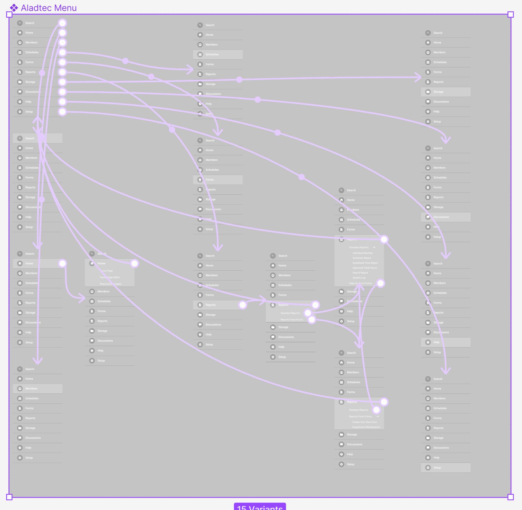
The final high-fidelity prototype was fully interactive and even included hover states, expandable submenus, and sliding animations. We incorporated our findings from round one of testing and made the menu slide over the page content without pushing or rearranging anything.

Accessibility considerations:

Color

App and text colors are calibrated to make reading more accessible on the app.

Icons

I used icons to help make navigation easier.

Animations

Animations were altered so the app maintains usability for all users.

Takeaways:

     Impact: 
          The immediate impact of my team’s redesign was that the Aladtec product looked like it belonged alongside the other products provided by the parent company. But more importantly, it became more user friendly. The user base for this product is older working individuals and they struggled with the inaccessible text, colors, and components.

    What I learned:
          In the overhaul of this product, I learned there are hundreds of tiny little things that make up a brand’s identity and each one has to cater to their users’ needs. The best way to learn about the users’ experience is from interviewing and listening the the users themselves. And that feedback really does make for an overall better product. 

     Next Steps:

  1. Conduct another round of usability studies to validate whether the updates to the new menu address the users’ pain points from round one.
  2. Conduct more user research to determine any new areas of need.

Thank you for your time reviewing my work on the Aladtec website!

© 2023 All Rights Reserved to Neal Julian