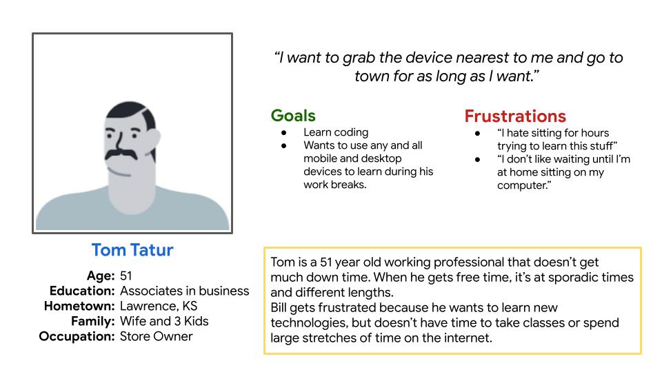
Neal Julian

Challenge:

     Design a tool to help tutor users in technical skills.

Project Overview:

     The product: 
        Cody is a responsive website, partnered with a dedicated mobile app that allows adult users to explore and learn all about coding, from anywhere, at any time, and at any pace.

     Project duration:
        April 2022

     The problem:
        Adults using new technology, or are new to technology in general, don’t have a dedicated approach that allows them to catch up on learning technical skills, such as coding.

     The goal:
        To create a dedicated mobile app and pair it with a responsive website that allows adult users access to advanced technology. This platform is also a great tool for “the next billion users” to get a jump on coding and coding languages.

     My role:
          UX Designer designing the Cody app and
website from conception to delivery.

     Responsibilities:
          Conducting interviews, paper and digital wireframing, low and high-fidelity prototyping, conducting usability studies, accounting for accessibility, and iterating on designs.

User Research:

     Summary:
          I conducted interviews and created empathy maps to understand the users I’m designing for and their needs. A primary user group identified through research were adults looking to expand on a very limited understanding of coding and different coding languages. Most are working professionals that needed a tool that was easy to pick up during short breaks in their work day, so they could learn at any pace they desired.

Persona:

Problem statement:

Tom is a 51 year old business owner who needs to learn new technical skills from multiple devices because his study time is infrequent and unexpected.

Initial Designs:

Paper Wireframes:

During the paper wireframe phrase I decided responsive website should be a hands on experience for learning coding, but because of the limited size of phone screens, the dedicated mobile app will be more about learning the processes in the abstract.
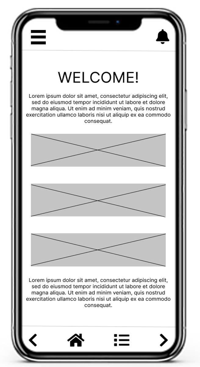
Digital Wireframes:

Our research showed that users wanted to jump in and out of their courses quickly, so the initial designs focused on having large noticeable buttons that allow users to easily find the module they are looking for.

Digital Wireframes:

Designs for the dedicated mobile app initially closely resembled the mobile version of the responsive website. This was changed later, but early designs show the similarities.

Low-Fidelity Prototype:

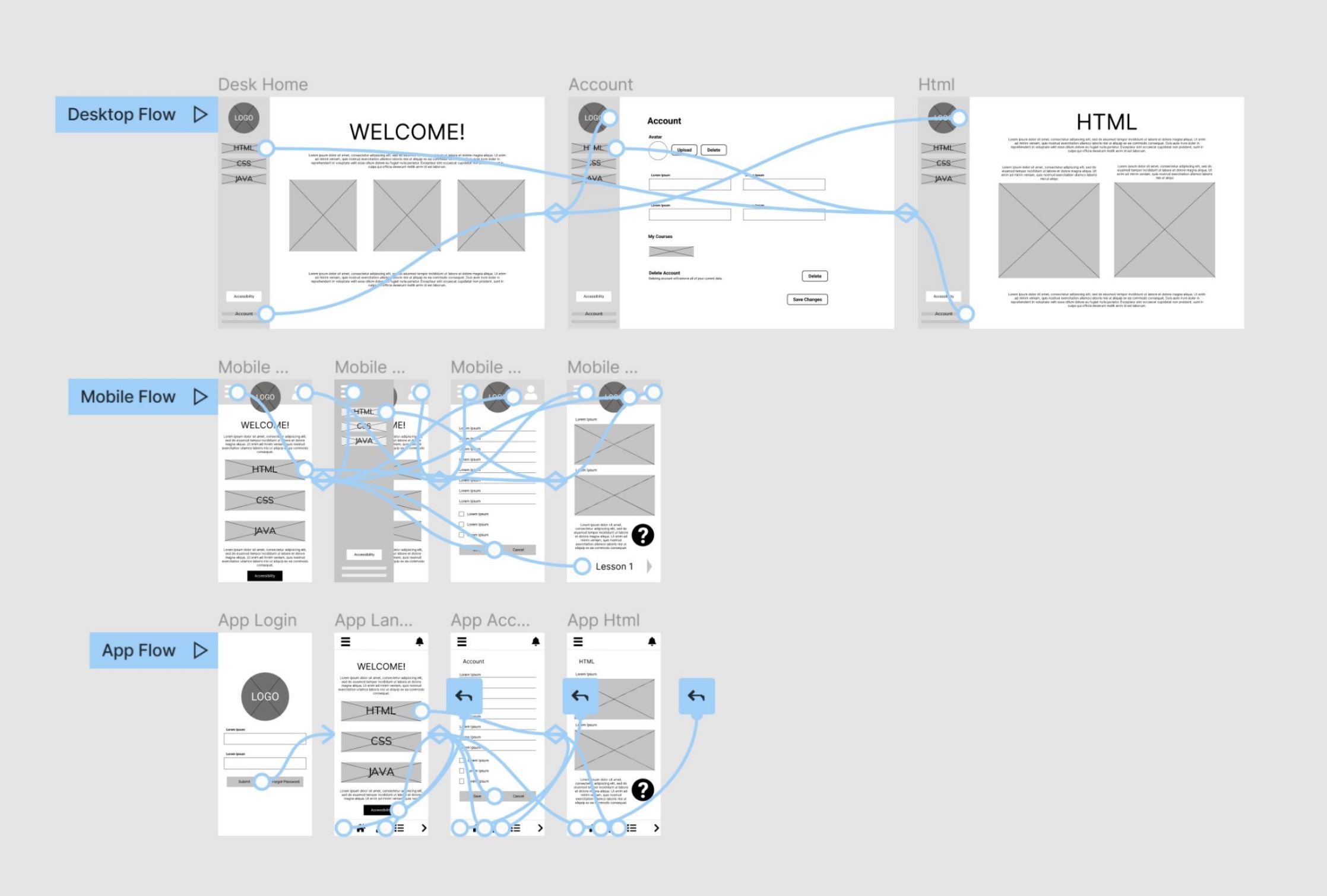
A low-fidelity prototype was created using the digital wireframes. The primary user flow shown was how to get from the home page to the first learning module, so the prototype could be used in a usability study.

Usability study:

     The Findings: 

Legibility

Some participants had trouble reading text.

Confusion

Participants didn’t locate the starting position of the first module.

Navigation

Some users were unable to quickly move around the site.

Mockups:

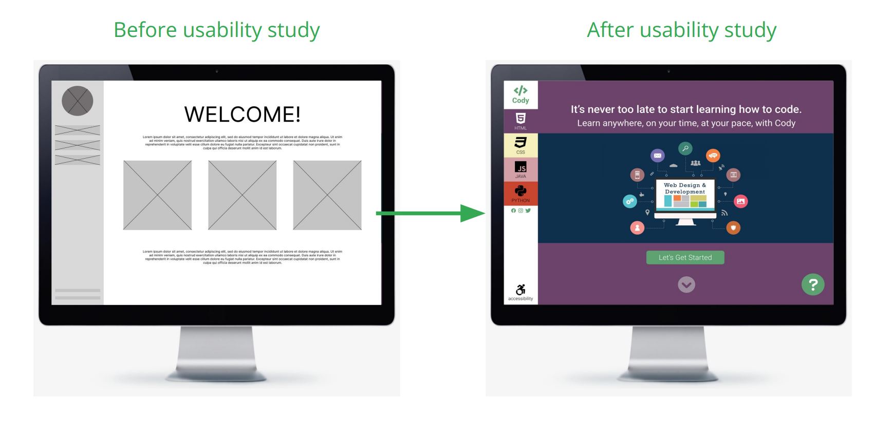
The greatest priority after testing was adding functionality for older users, specifically accessibility controls and an obvious help function.

Accessibility considerations:

Controls

An always available accessibility icon and button were added at the bottom of the menu bar. This allow users to customize font typeface, size, and color.

Icons

Icons were used to help make navigation easier.

Colors

Colors were tested and altered according to accessibility standards.

Takeaways:

     Impact: 
          The app and responsive website help make users feel like they are becoming a part of our technologically advanced world.
           One quote from peer feedback: “This is amazing!”

    What I learned:
          In designing this app and responsive website I realized that accessibility should always be one of the most important considerations while designing. The best way to learn about the users’ experience and their needs is from interviewing and listening the the users themselves. And that feedback really does make for an overall better product.

     Next Steps:

  1. Conduct another round of usability studies to validate whether the pain points users experienced have been effectively addressed. 
  2. Conduct more user research to determine any new areas of need.

Thank you for your time reviewing my work on the
Cody app and responsive website!

© 2023 All Rights Reserved to Neal Julian